Client: Bussole | Deliverables: Naming, Brand Identity, Visual Identity, Assets and UI.
Overview
Bussole, a startup focused on financial literacy for immigrants aged 25-45 in Canada, reconnected with me to refine their visual identity as they prepare to launch. Their mission is to guide newcomers on their financial journey with a playful yet professional brand
Challenge
Transition Bussole's brand from a travel agency concept to a trusted financial literacy resource, ensuring the visual identity remains simple, accessible, and approachable. See the previous branding I made for them when they were a travel agency here.
Solution
Developed a fresh visual identity that blends playful with professional, using a unique color palette and an overall interesting identity. This new identity positions Bussole as a welcoming and authoritative guide for financial literacy.
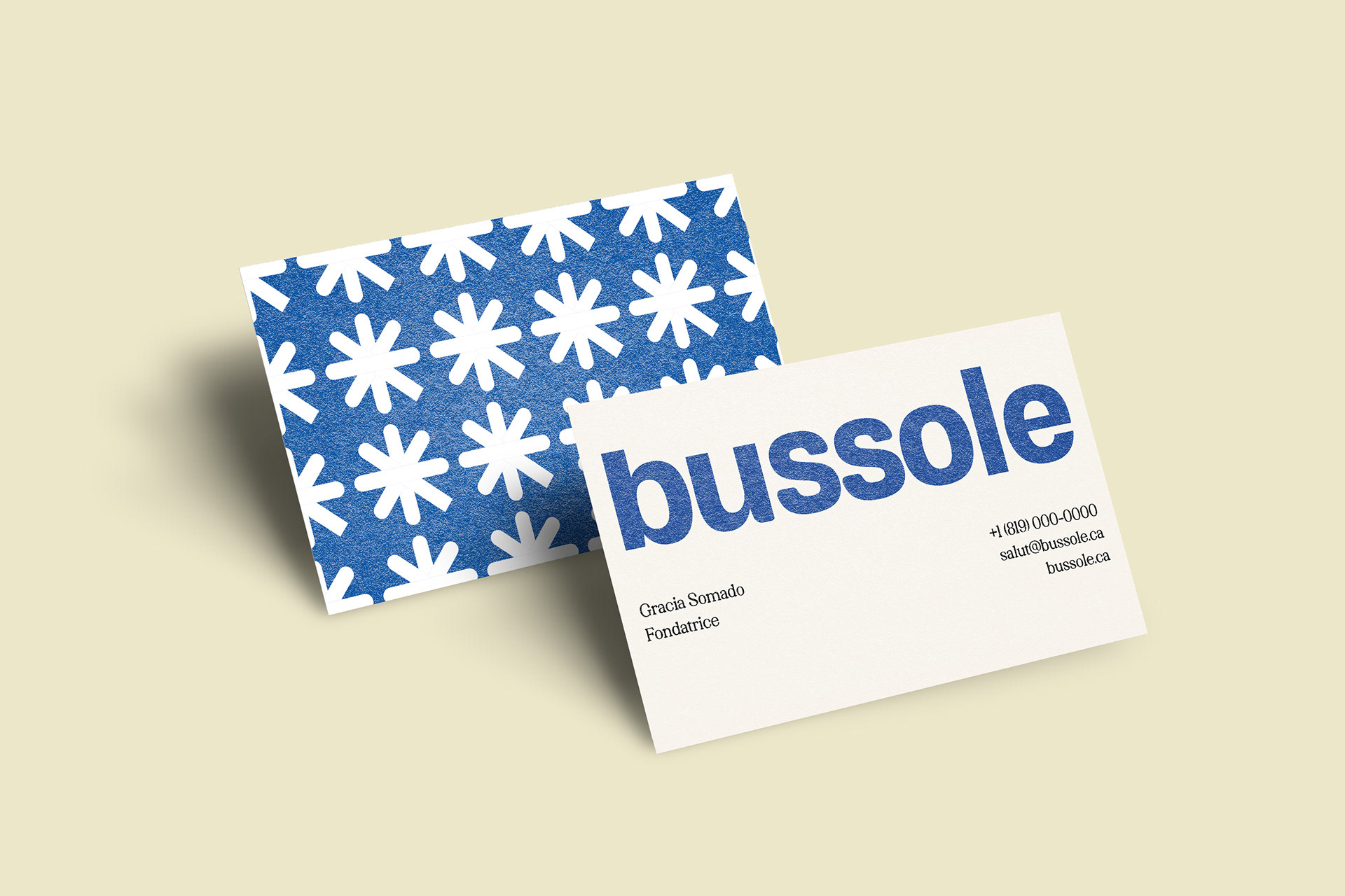
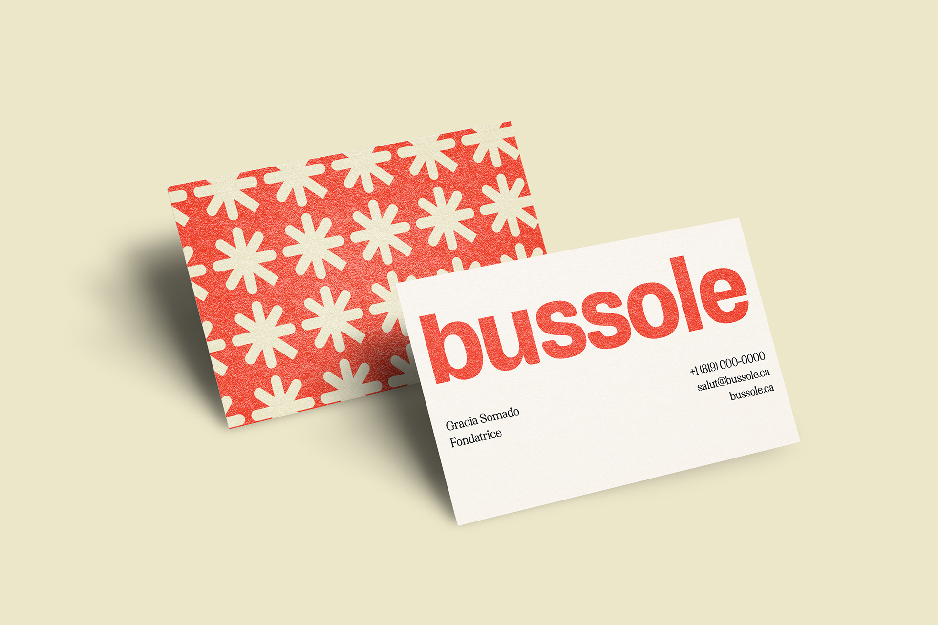
A story behind the logo
I believe that a logo with a meaningful concept is more powerful. I was involved in the naming process for Bussole, which is homonymous to the noun "boussole" in French, meaning "compass," guiding newcomers to financial literacy.
Sensible colors that defy financial language.
The color choice is intentionally different from typical financial designs. It makes Bussole more approachable. We chose this blue after iterations as it easily translates well on both print and digital medium, plus blue inspires trust. The red chili is an stretched reference to the canadian flag and adds vitality to the brand. The creme colors enable a neutral look while preventing boredom. Finally, instead of a pure black, we chose a night color to afect depth.

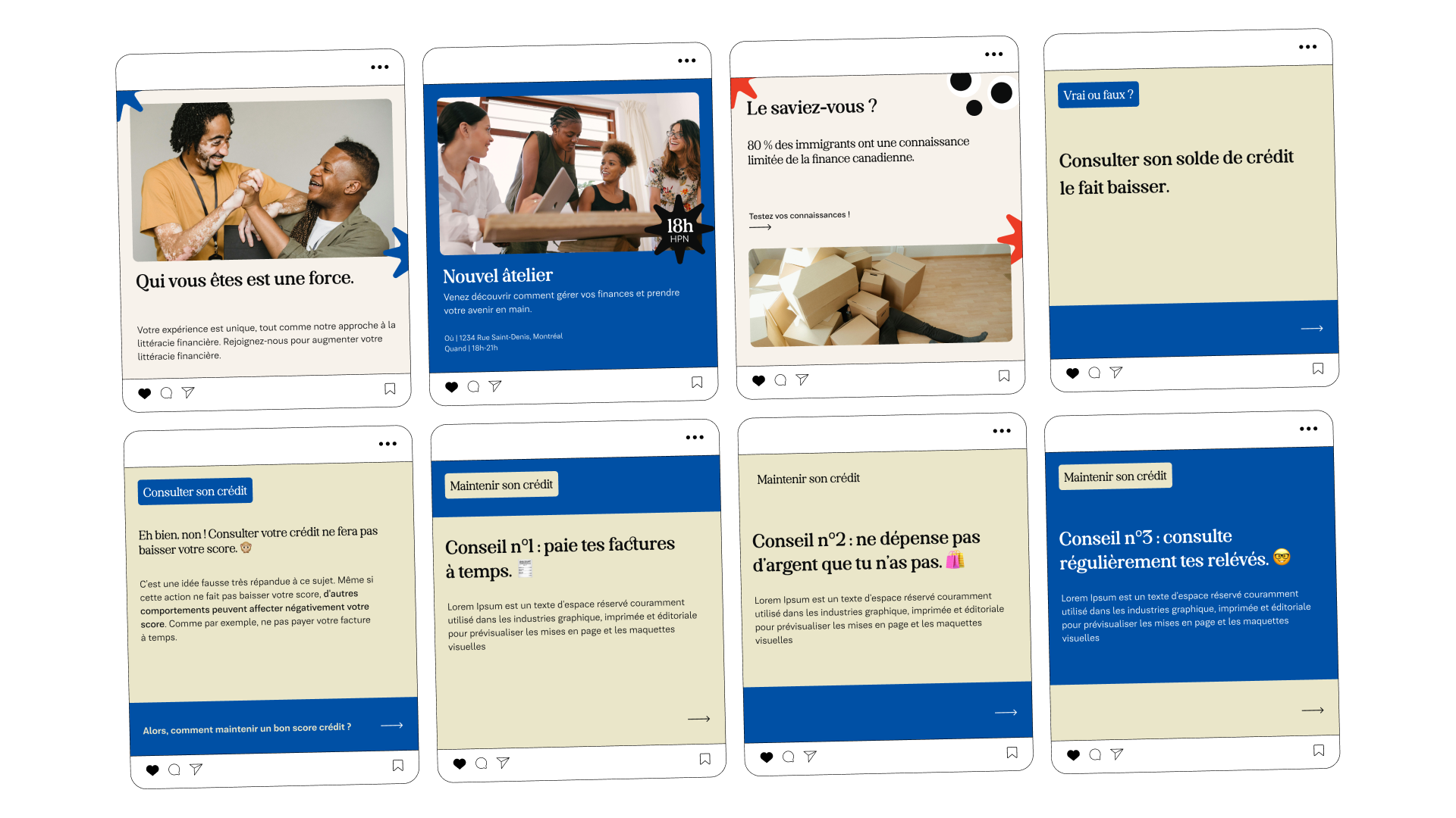


Take a look at the brand guidelines
Process
Understand the brand's needs and personality through visual boards
The changes in the organization of Bussole have required me to gain a fresh understanding of their market offerings and how to present them effectively. After our initial meeting, I created a basic photo board with keywords to visually represent my understanding of the company based on our call.
First general visual board
After clarifying with the client, I had an insight: Bussole wants to look and feel approchable, fun and professional. Once the look and feel of the brand was confirmed, I started ideating on ways to let the identity shine.
Iterated general visual board
Sub-directions
Once the overall direction was established, I created two distinct approaches for Bussole to showcase its unique expression.
The first sub-direction was younger and bolder. It emphasized the friendly qualities of the brand, but it didn't align with the target audience or the professional image we wanted for the brand. I addressed those concerns in the second sub-direction.
sub-direction 1
sub-direction 2
Iterations in the making
some logo sketches
