University Project | Work: UI Design, Coding
Overview
The project was about making a simple user interface that provides a good user experience and creating a portfolio that fits a selected artist's vision – in this case, Wes Anderson's.
Experience developped landing page here: https://codepen.io/Ebenezer-Somado/live/abrEgeN
Thought Process
Analyzing Wes Anderson's style
Who is he?
Wes Anderson is a celebrated American filmmaker known for his distinct style and has earned 82 awards in his career. He was nominated for an Academy Award for "The Grand Budapest Hotel" and is also known for films like "Mr. Fox" and "Moonrise Kingdom".
How can I create a user interface that has Anderson's aesthetic, but also includes my own personal touch?
To answer this leading question in my design, I studied Anderson's relationship to image in multiple of his work. I gathered stills from movies he directed and analyzed the patterns I could find in color and composition.
Research impact on the user interface I created
I noticed Wes Anderson has a unique and carefully curated style, so I wanted to reflect that in the portfolio I created for him. I chose to play with the idea of composition and symmetry for the portfolio, to emulate the omnipresent idea of symmetry in Anderson's work.
Layout iterations
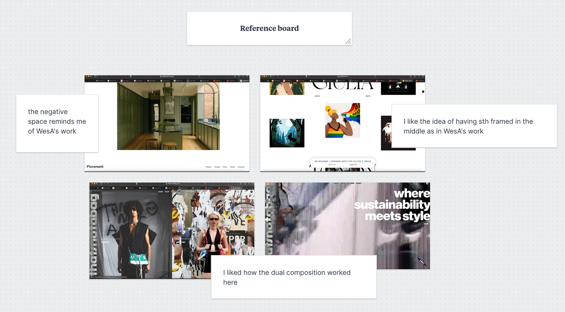
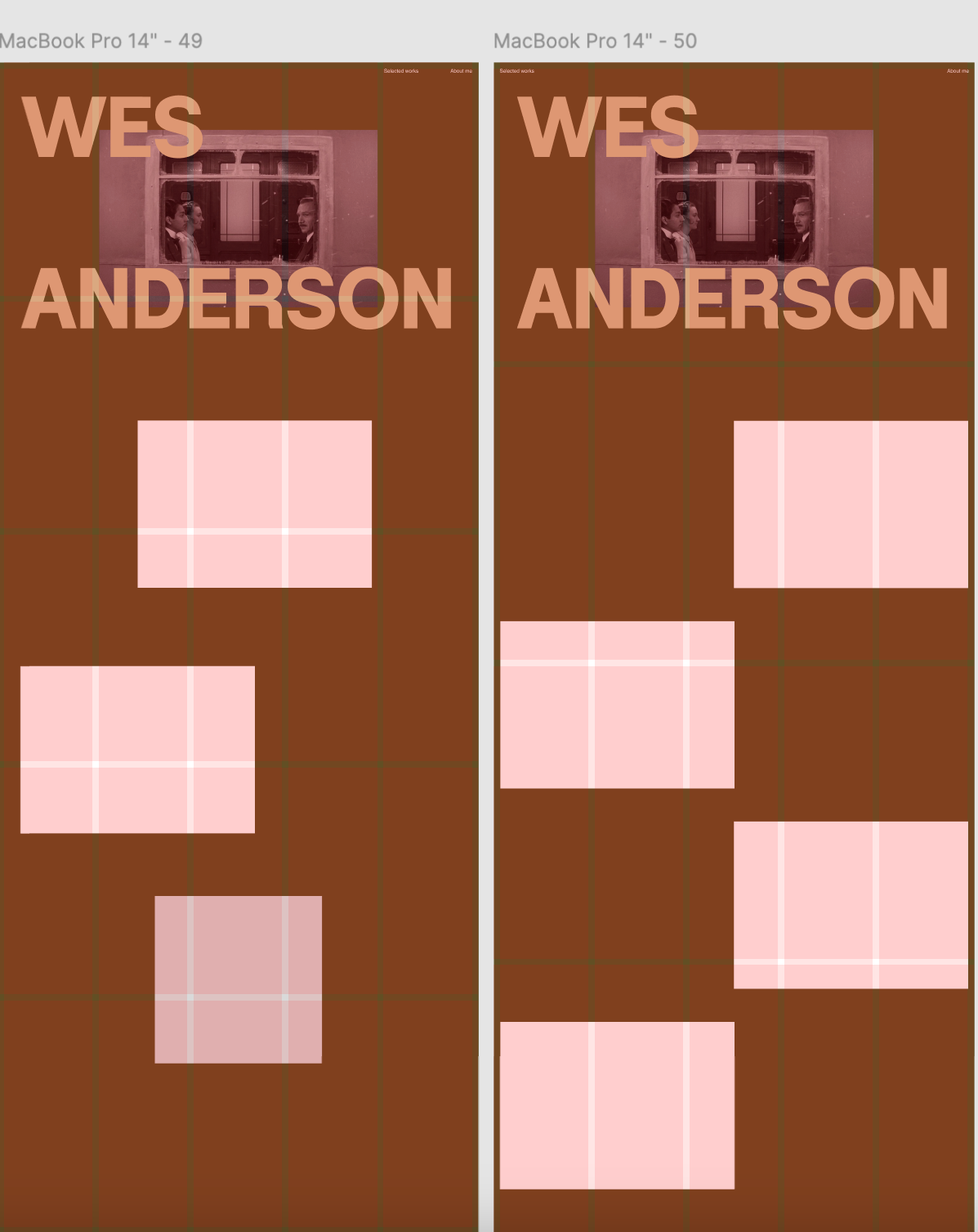
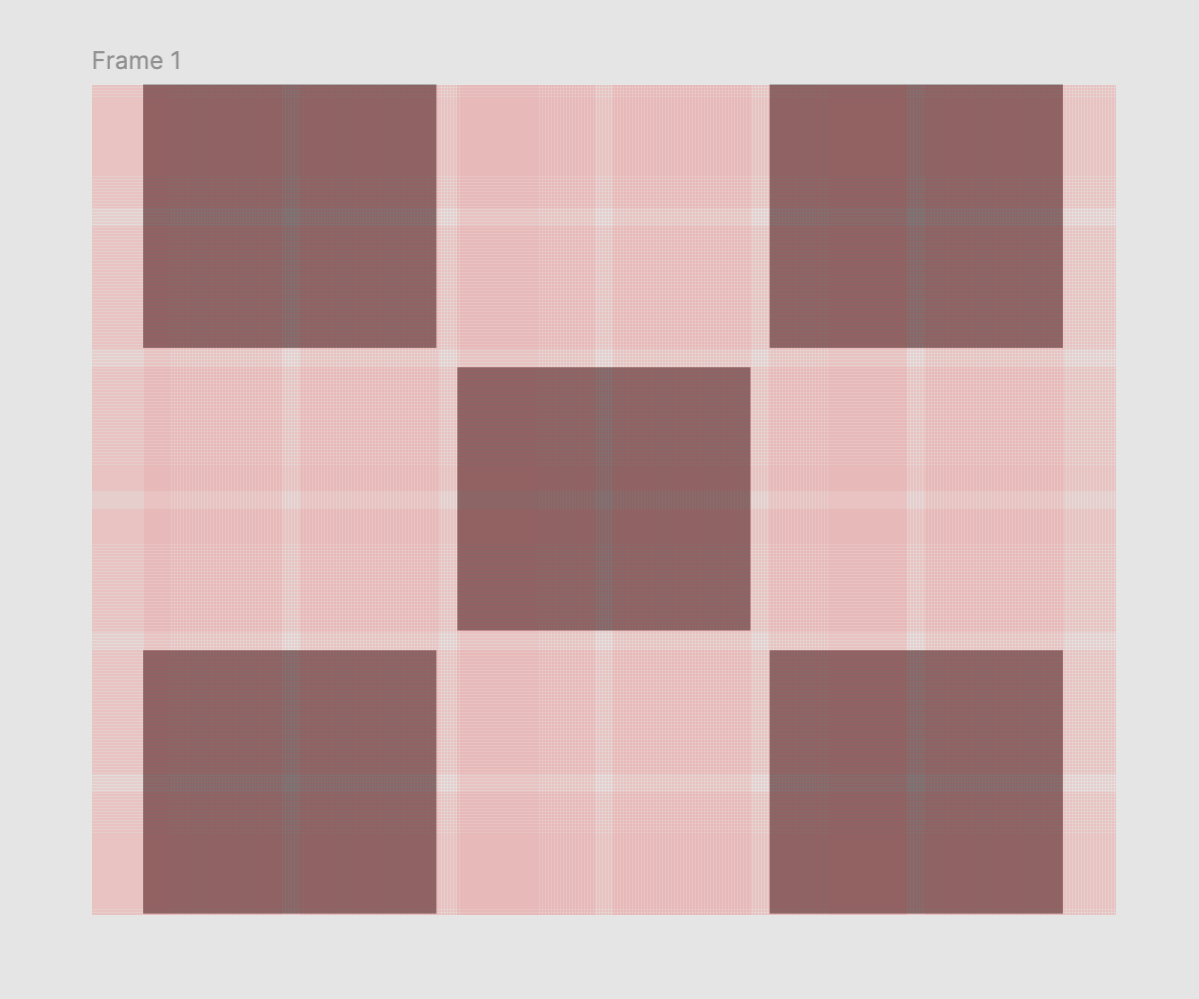

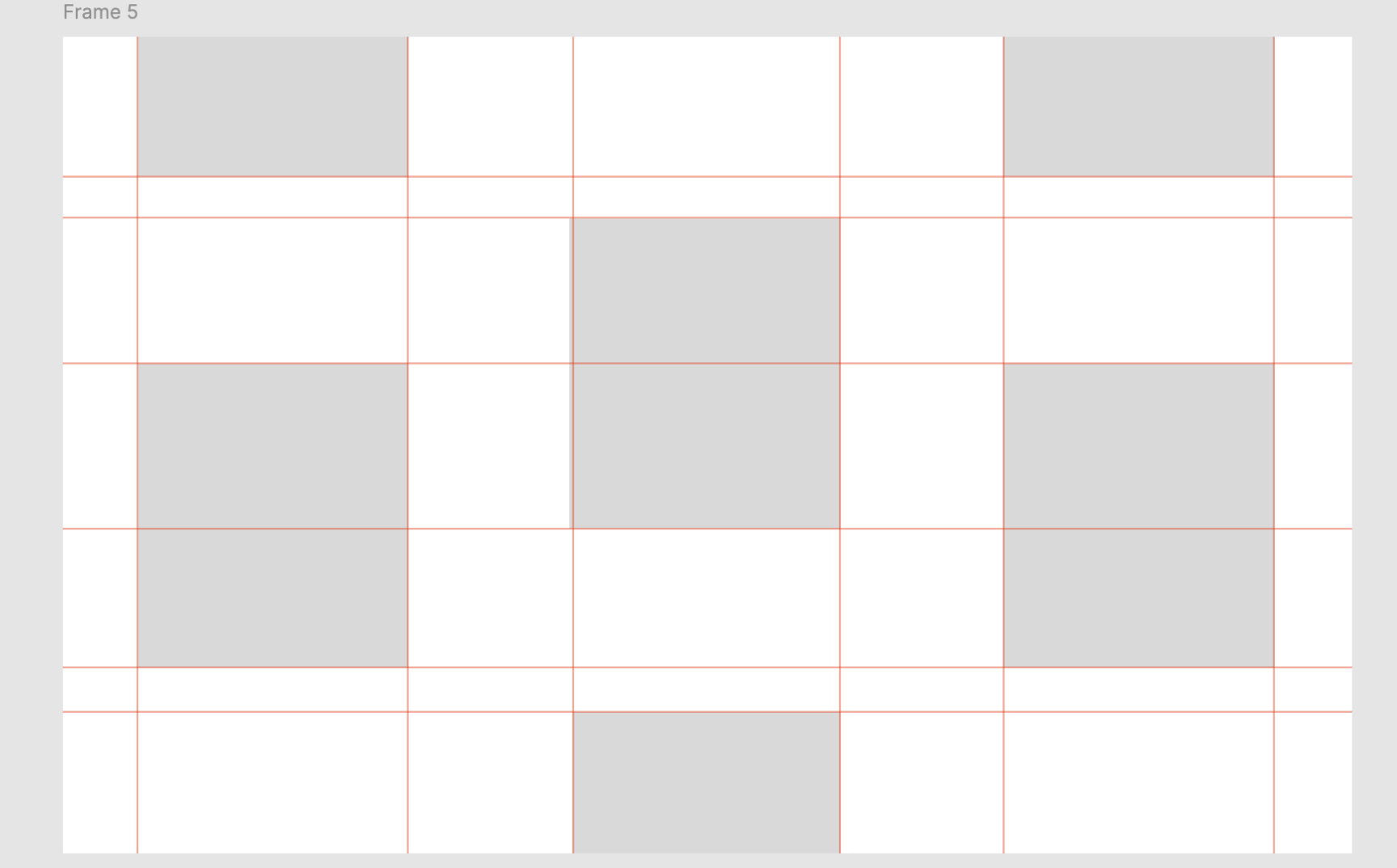
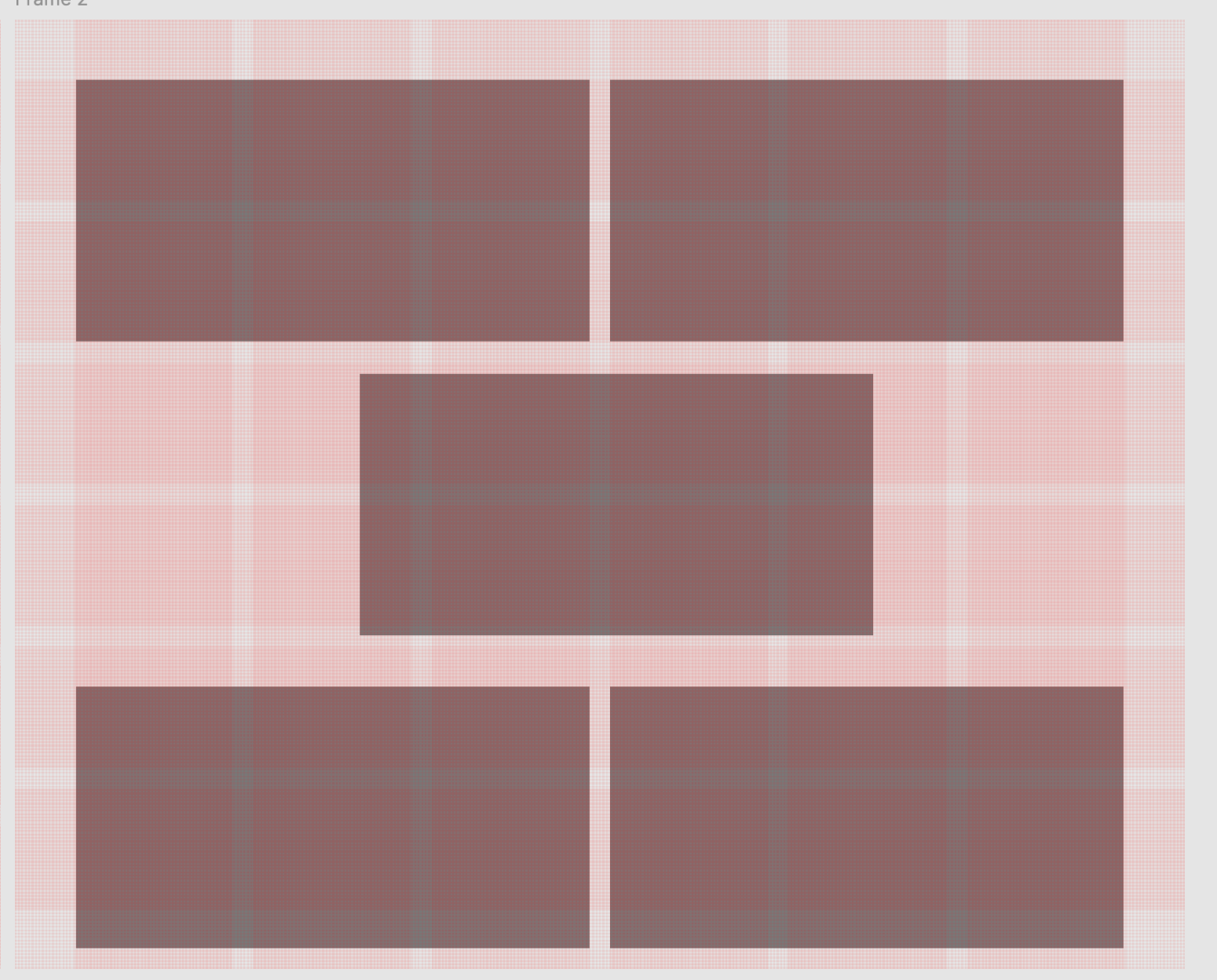
Challenges and reasoning behind structural decisions
Symmetry: I began with small margins but felt they didn't capture the "Wes Anderson" vibe. The symmetrical effect I wanted wasn't fully achieved.
Custom Grid Creation: Inspired by the Giulia website, I designed my own grid. However, the squares created a chess-like look instead of Anderson's typical rectangular compositions, prompting me to adjust the grid to better suit rectangular shapes.
Aesthetic and Negative Space: Though I considered rounding the rectangles for aesthetic preference, I kept them sharp to align with Anderson's style. Emphasizing rectangular shapes initially reduced the crucial negative space, so I adjusted the grid for consistent screen sizes.
Color Selection and Visual Style: Finding a suitable background color was challenging, as each of Anderson's films has its unique tone. To address this, I structured the project with a scroll-based design, allowing each section to reflect different tonal inspirations. Considering the color palette and the overall concept of symmetry, I revised the landing page's hero section to have a visually captivating image that attracts visitors. I also chose a bold sans-serif font that honors Anderson's timeless yet contemporary style.
Coding
See my code here.